Jason Moragas

Ranking All MLB City Connect Uniforms
I’ve previously attempted to rank the City Connect uniforms before, but I felt this system of doing so didn’t create a complete depiction of the…
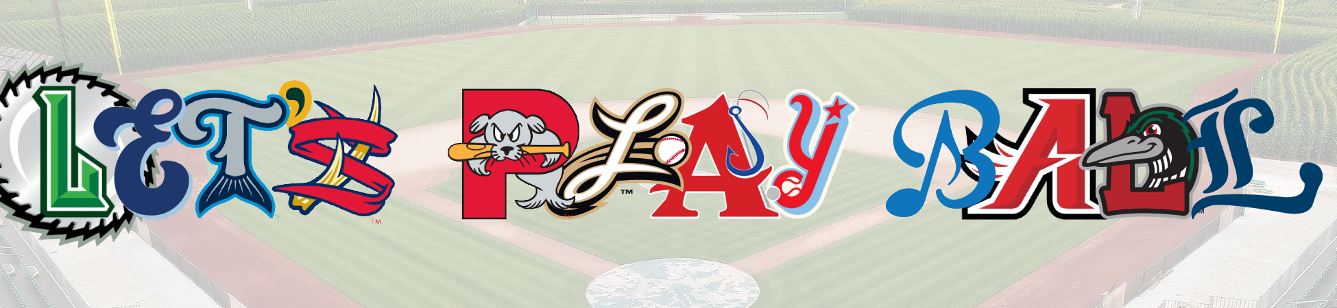
An Off-Season of Minor League Research
Last summer, the Rome Braves announced they would be adopting a new name for the 2024 season, dropping their parent club’s with which they had…
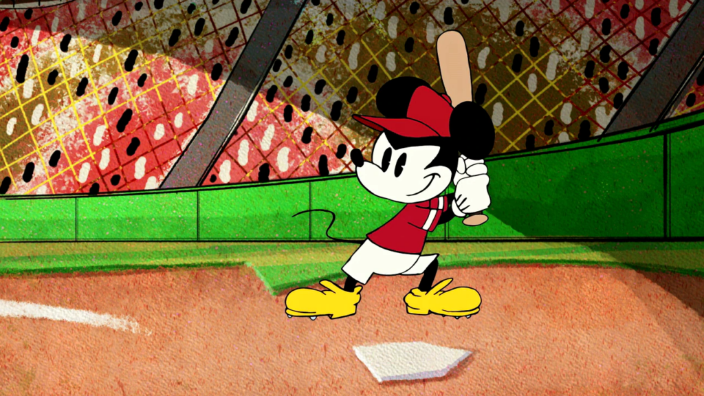
Baseball & Disney: A Brief History
On this day in 1901, Walter Elias Disney was born in Chicago, Illinois. I’m sure you have all heard what this guy would accomplish in…
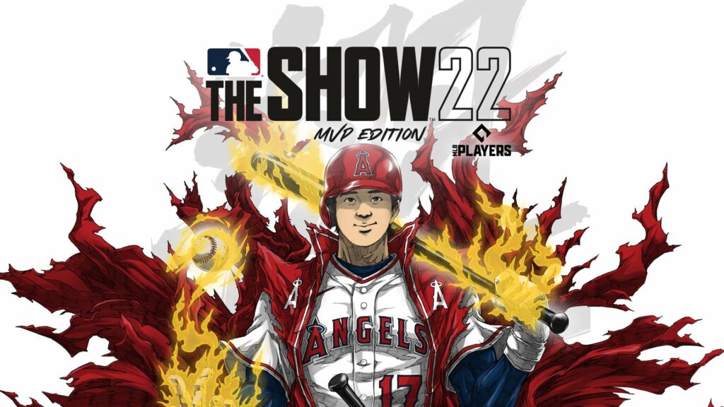
Players to Appear on Video Game Covers by fWAR
On January 31 of this year, Shohei Ohtani was named the cover player for MLB The Show 2022. He then went on to have one of…